User Experience
Here are some helpful guidelines on User Experience from Everett McKay that can help you get started:
Real objects are more fun than buttons and menus.
An Android design principle. To achieve this, show me actual data visualized in interesting ways. Consider a slider in the first screen or two that showcases your best data. Show, don’t describe. Reconsider the large icons, which show nothing and are decidedly not fun.
Don’t make me think.
A famous line from Steve Krug. In this case, don’t make me read and don’t make me scroll. Prefer concise and visual over big and textual.
Get right down to business.
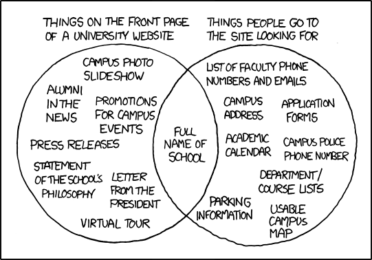
One of mine, but it’s worth noting that the home page is currently 12 phone screens long. But it certainly doesn’t have 12 screens of useful information.
Users don’t read, they scan.
Simplify and optimize for what your users care about. Apply these to achieve the last goal. Consider navigating to other pages to show secondary and tertiary information. To evaluate, see the Highlighter test below.
Immediately set my expectations.
What do you have to offer? Why do I care? That should be immediately obvious. (After using the app for about 15 minutes, I honestly couldn’t answer these questions with confidence.)
Make search rewarding.
After engaging users with the home page content, the most likely steps are to search for stuff or navigate using the HBM. Make sure your search can find what people are looking for (to determine: keep stats on searches, especially those where users don’t click any results or bounce back to the results list quickly.) Make sure that people can find:
- synonyms (park, parking)
- related terms (garage)
- equivalents (1 vs. one)
Also, put counts next to the search terms to help people know what they can expect to find. (If one term has 100 matches but another has 3, I now have a clue.)
Focus on insights and information, not raw data.
A hard one to explain concisely, but a great example is shown in "Creating a website for the nation." The best example is they now return the next holiday rather than a spreadsheet with all the holidays, because that is usually the intent.
Make it feel like a human conversation.
Here is something to try:
As a team, think about how you would explain your site to your various target users in person, then compare that conversation to what you actually have on the screens. The more that the content and the phrasing matches, the better the site. Unusual I know, but try it! (book resource: UI is Communication, Everett McKay)
An anti-pattern.
Avoid this:
To evaluate, use a “highlighter test".
From the point of view of the different user types/personas, take a printout of the home screen and highlight what is useful (using a different color for each role.) Emphasize and prioritize what gets highlighted, and reduce or remove what doesn’t.